
Results
First and second funding period
Due to the large size, and the time-dependency of these datasets, the data transfer between secondary storage, main memory and graphics memory becomes the severe bottleneck. Different transfer methods have been evaluated using automated tests to develop an optimal implementation (publication: pvis09-grottel).
|
|
|
|
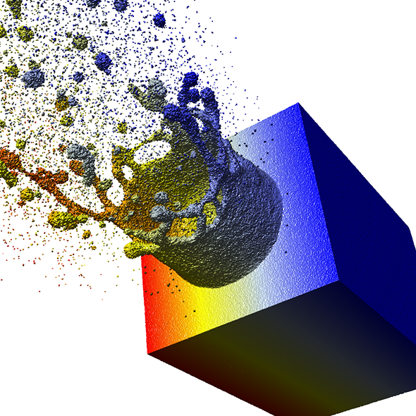
Using datasets from subproject B.5 a two-phase culling approach has been developed and optimized for particle-based data. Using this approach, an interactive representation of 107 to 109 particles is possible on a standard workstation (publication: eurovis10-grottel). For example, the simulation data of a laser-ablation containing 48 million particles can be rendered interactively at 10FPS (Figure 2). Any potential for improvements to increase rendering speed on workstation computers is therefore almost exhausted. Further speedup to visualize bigger datasets interactively can be achieved using GPU-clusters. It is planned to investigate ways to ease the data transfer bottleneck using load balancing on GPU-clusters.
To improve representation quality besides rendering speed as well the “deferred shading” based visualization has been extended. This method allows representations of surfaces formed by many particles to be rendered without aliasing effects. Usually aliasing will occur when single particles are rendered in sub-pixel range.
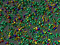
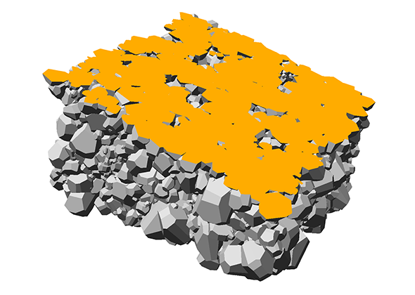
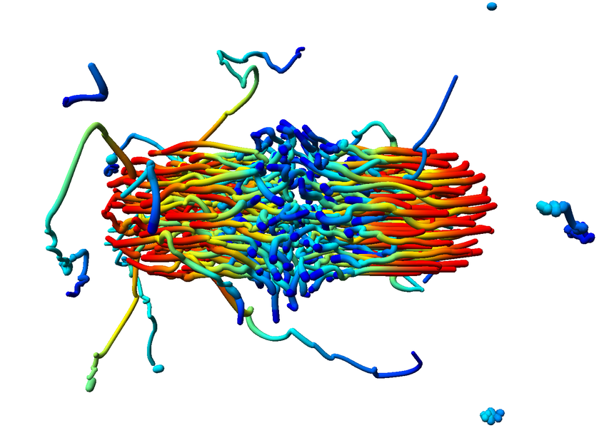
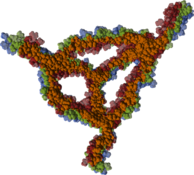
The aspect of optimal rendering methods for complex glyph representations has been investigated as well. The work on dipole glyphs (Fig. 1) served as starting point for composite glyphs for molecules without inner degrees of freedom (Fig. 3). These molecule representations can be composed on either CPU or GPU and hence be optimized for different datasets. Based on these experiences, a rendering technique has been developed for polyhedron-based glyphs in close cooperation with subproject B.3 (Fig. 4; publication: sigrad10-grottel). This sampling free rendering approach is suitable for porous media, which will also be applicable for the work of for subproject A.6. Semi-automated methods of visual analysis will be developed based on this technique.
|
|
|

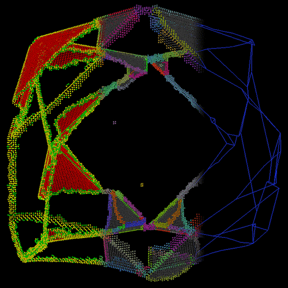
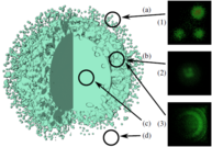
To enhance perception and understanding of the presented data, filtering is needed. Representations using sphere glyphs can show particle data in a direct way and thus form a basis for analysis and optimization. However visually analyzing the data, especially its internal structure, extraction methods and abstract representations are useful. In this context, visualization of crystal defects in metals has been done in cooperation with subproject B.2 (Fig. 5; publication: topoinvis09-grottel). Cooperations with subprojects B.1 and B.7 will be formed based on this work.
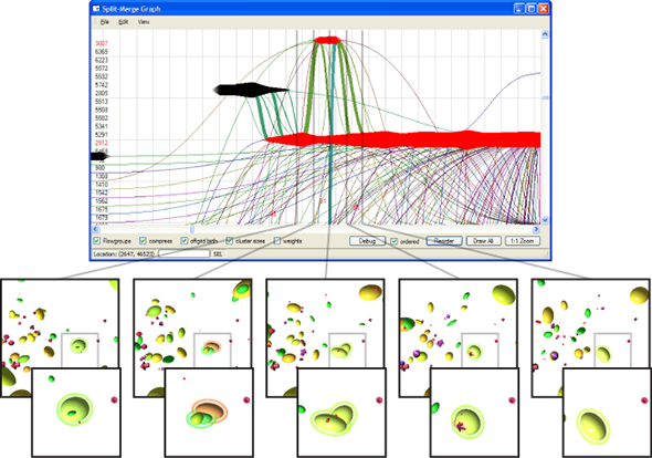
Structures inside datasets are of special interest if we want to observe temporal development of this data. It is nearly impossible to find such phenomena in raw data consisting of atom positions, whereas we gain a lot more insight by observing abstract structures in time-dependent datasets. Using visual analysis, developments over time in molecular clusters of a nucleation simulation have been identified in cooperation with subproject A.1. Especially interaction between molecular clusters has been the main focus here. Using this method we can identify problems in cluster classification (Figure 6; publication: vis07grottel). Based on this work temporal phenomena will be investigated in datasets of subproject A.8 and B.6.
|
|
|
|
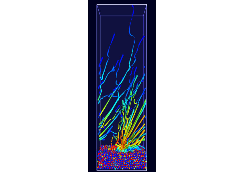
Combine these abstract representations of time-dependent phenomena with direct spatial visualization like path lines, a method has been developed in cooperation with A.1 and B.5 to show such dynamic behavior using static pictures. To compensate for overlap and visual overload when using path lines the dataset has been filtered using new, density conserving clustering techniques. The clustered data created by this filtering can be traced over time in normal physical space (Fig. 7; publication: pacificvis11-frey). Based on this work other static representations of dynamic phenomena will be developed for other subprojects inside SFB, allowing more effective analysis.
Subproject D.3 will continue its successful work from the first funding period and strive for further improvement of existing visualization techniques as well as development of new methods to visualize larger, time dependent particle datasets. The methods developed in D.3 will show their usefulness in cooperation with other subprojects hereafter.
By continuing the work from the second funding period we were able to achieve progress in the areas of large data sets, ensembles, as well as improving the visualization in general. So, the visualization quality of visual analysis of three dimensional structures could be improved significantly.
New abstractions of complex issues like dipol-moments in metal oxides and hydrogen bridges in polymer-solvent-interactions were published successfully.
For better perception of depth variations in simulated data sets, a high resolution stereo projection was built and used in the SFB projects. In this context, a generic procedure for distributed computation and visualization on this display was published.
As a contribution to high performance computing, we presented a method to better utilize the performance of GPUs.
A problem of today's graphic processors is branching divergence (e.g. if) when many of the parallel working processors work on different code. Normally, this problem is solved by executing all code and masking the write back of the results. To prevent the double execution, we presented an approach which regroups the code branches to improve the performance.
The application oriented visualization framework MegaMol™ is used by collaboration partners at other universities like Paderborn, Kaiserslautern und Dresden. It suites the needs of the particle based research within the SFB better than any other openly accessible visualization system.
The newest addition here is a graphic editor which dynamically connects and configures the modules. This makes it easier for the user to identify the relevant modules and combine them for research.
|
|

|
So sub project D.3 continues the highly successful work from the first two funding periods and still seeks to constantly improve the existing visualization techniques and the development of new methods for displaying large and time-dependent particle data sets. The usability of the created methods is given by the tight collaboration with other sub projects of the SFB.
The work of the second funding period led to the PhD. thesis of the project scientist S. Grottel and was honored with the Doktorandenpreis of the SFB 716.
Third funding period
During the third funding period, we were able to win the IEEE SciVis Contest 2016 in a joint effort of the sub-projects D.3, D.4, and A.6, as well as partners from CRC 75 and the TU Dresden. The task of this contest was to compare the properties of evolving viscous fingers across different simulation runs of salt dissolving in water. Aggregated properties were collected into a database that a user can browse with our visual analysis tool (cf. Figure 1 and 2).

|

|
Dealing with large, particle-based datasets requires data structures and algorithms to access data on memory as efficient as possible - not only for rendering and visual analysis purposes. However, measuring efficiency is a difficult task and interpreting statistical measures makes it difficult to find hints for code optimizations. In order to assess the memory efficiency of the software we use in this sub-project, we developed a visual analysis tool (cf. Figure 2) that gathers information on each individual memory access at runtime of an application. It presents these accesses in a way that puts emphasis on the underlying access patterns. Knowledgeable users can immediately detect detrimental patterns and, based on the type of pattern, find a solution to improve performance. This work has been awarded Best Paper at VISSOFT 2017.

|